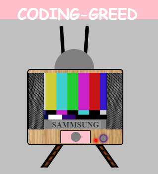
CSS Animating Television
HTML:
CSS:
OUTPUT:
This file contains bidirectional Unicode text that may be interpreted or compiled differently than what appears below. To review, open the file in an editor that reveals hidden Unicode characters.
Learn more about bidirectional Unicode characters
<!DOCTYPE html> | |
<html> | |
<head> | |
<title>Page Title</title> | |
</head> | |
<body> | |
<a href="#" style="text-decoration:none"> | |
<fieldset class="rose"> | |
<center>CODING-GREED</center> | |
</fieldset> | |
</a> | |
<div id="whole"> | |
<div class="dd"> | |
<div class="at1"></div> | |
<div class="at2"></div> | |
<div class="at3"></div> | |
</div> | |
<div class="outer"> | |
<div class="sp1"> </div> | |
<div class="sp2"></div> | |
<div class="s1"> | |
</div> | |
<div class="name"> | |
<center style="position:relative;top:2px;"><b>SAMMSUNG</b></center> | |
</div> | |
<a href="https://coding-greed.blogspot.com/?m=0" style="text-decoration:none"> | |
<div class="bottom"> | |
<div class="eyesq"> | |
<div class="eyecr"></div> | |
<div class="light"></div> | |
<div class="switch"></div> | |
</div> | |
</a> | |
</div> | |
</div> | |
</div> | |
<div class="stand"> | |
<div class="st1"></div> | |
<div class="st2"></div> | |
</div> | |
<br /><br /><br /> | |
<div> | |
<center style="background-color:pink;color:white;font-family:cursive;font-weight:bolder;font-size:3em;margin-top:30px;text-decoration:none;">Television</center> | |
</a> | |
</div> | |
</body> | |
</html> |
This file contains bidirectional Unicode text that may be interpreted or compiled differently than what appears below. To review, open the file in an editor that reveals hidden Unicode characters.
Learn more about bidirectional Unicode characters
body { | |
background-color: silver; | |
} | |
.ppn { | |
margin-top: -3px; | |
width: 30px; | |
height: 30px; | |
float: left; | |
border-radius: 40px 40px 40px 40px; | |
} | |
.rose { | |
border: none; | |
background-color: pink; | |
color: white; | |
height: 15px; | |
font-weight: bolder; | |
font-family: "Sacramento", cursive; | |
font-size: 30px; | |
} | |
#whole { | |
margin-left: 39%; | |
margin-top: 30px; | |
} | |
.outer { | |
background-color: red; | |
border: 2px solid black; | |
width: 190px; | |
height: 150px; | |
border-radius: 7px; | |
background-image: url(https://i.ibb.co/SdD7Jmy/1561631683970.jpg); | |
} | |
.sp1 { | |
width: 30px; | |
height: 112px; | |
background-image: url(https://i.ibb.co/Wv8TZns/20190627-120046.jpg); | |
border: 1px solid black; | |
float: left; | |
background-size: 200%; | |
position: relative; | |
top: 6px; | |
z-index: 10; | |
} | |
.sp2 { | |
width: 30px; | |
height: 112px; | |
background-image: url(https://i.ibb.co/Wv8TZns/20190627-120046.jpg); | |
border: 1px solid black; | |
float: right; | |
background-size: 200%; | |
position: relative; | |
top: 6px; | |
} | |
.s1 { | |
width: 150px; | |
height: 94px; | |
background-color: green; | |
margin-left: 15px; | |
margin-top: 6px; | |
background-image: url("https://i.ibb.co/qkSGz09/tumblr-nouc0p-G3-Fz1qedb29o1-500.gif"); | |
background-size: 100%; | |
} | |
.name { | |
width: 145px; | |
height: 20px; | |
background-color: gray; | |
margin-left: 15px; | |
} | |
.bottom { | |
background-color: blue; | |
width: 190px; | |
height: 30px; | |
border-radius: 0px 0px 5px 5px; | |
background-image: url(https://i.ibb.co/SdD7Jmy/1561631683970.jpg); | |
} | |
.eyesq { | |
width: 60px; | |
height: 25px; | |
background-color: pink; | |
margin-left: 65px; | |
position: relative; | |
top: 2.2px; | |
border: 0.5px solid black; | |
} | |
.eyecr { | |
width: 20px; | |
height: 20px; | |
background-color: gray; | |
border-radius: 20px; | |
position: absolute; | |
top: 2px; | |
left: 20px; | |
} | |
.light { | |
width: 5px; | |
height: 5px; | |
background-color: red; | |
border-radius: 5px; | |
position: relative; | |
left: 68px; | |
top: 17px; | |
border: 0.2px; | |
box-shadow: 0px 0px 4px 2px red; | |
} | |
.switch { | |
width: 12px; | |
height: 12px; | |
border-radius: 12px; | |
background-color: gray; | |
position: relative; | |
left: 80px; | |
top: 4px; | |
box-shadow: 0px 0px 3px 3px; | |
} | |
.dd { | |
width: 190px; | |
height: 70px; | |
/* background-color:purple;*/ | |
} | |
.at1 { | |
width: 5px; | |
height: 70px; | |
background-color: black; | |
border: 1px solid black; | |
float: left; | |
border-radius: 10px 10px 0px 0px; | |
margin-left: 70px; | |
transform: rotate(-30deg); | |
position: relative; | |
bottom: 17px; | |
animation-name: ok1; | |
animation-iteration-count: infinite; | |
animation-delay: 2s; | |
animation-duration: 5s; | |
transform-origin: bottom; | |
} | |
@keyframes ok1 { | |
0% { | |
transform: rotate(-30deg); | |
} | |
50% { | |
transform: rotate(30deg); | |
} | |
100% { | |
transform: rotate(-30deg); | |
} | |
} | |
.at2 { | |
width: 5px; | |
height: 70px; | |
background-color: black; | |
float: right; | |
border: 1px solid black; | |
border-radius: 10px 10px 0px 0px; | |
margin-right: 70px; | |
transform: rotate(30deg); | |
bottom: 17px; | |
position: relative; | |
animation-name: ok2; | |
animation-iteration-count: infinite; | |
animation-delay: 2s; | |
animation-duration: 5s; | |
transform-origin: bottom; | |
} | |
@keyframes ok2 { | |
0% { | |
transform: rotate(30deg); | |
} | |
50% { | |
transform: rotate(-30deg); | |
} | |
100% { | |
transform: rotate(30deg); | |
} | |
} | |
.at3 { | |
width: 80px; | |
height: 40px; | |
background-color: grey; | |
border-radius: 100px 100px 0px 0px; | |
margin-left: 55px; | |
top: 30px; | |
position: relative; | |
/* background-image:url(https://i.ibb.co/Tm6LZVZ/IMG-20190627-155847.jpg);*/ | |
background-size: 10%; | |
} | |
.st1 { | |
width: 15px; | |
height: 45px; | |
background-color: brown; | |
transform: skewX(-35deg); | |
float: left; | |
margin-left: 80px; | |
background-size: 100%; | |
background-image: url(https://i.ibb.co/Tm6LZVZ/IMG-20190627-155847.jpg); | |
position: relative; | |
left: 20em; | |
} | |
.st2 { | |
width: 15px; | |
height: 45px; | |
background-color: brown; | |
background-image: url(https://i.ibb.co/Tm6LZVZ/IMG-20190627-155847.jpg); | |
background-size: 100%; | |
transform: skewX(35deg); | |
position: relative; | |
left: 32em; | |
} |
!Copy this code and use as your wish!
No comments:
Post a Comment