Saturday 17 September 2022

Single DIV Pokeball

 MAKING SINGLE DIV ELEMENT POKEBALL


HTML:

<html>
    <head></head>
    <body>
        <div></div>
    </body>

    <style>

CSS:

 html{
            background: #6CB3A9;
        }

        div{
            width: 250px;
            height: 50px;
            background: #781728;
            position: absolute;
            transform: translate(-50%,-50%);
            top: 50%;
            left: 50%;
        }

        div:before{
            content: '';
            position: absolute;
            width: 280px;
            height: 280px;
            background: linear-gradient( #D25B70 0px 125px,transparent 125px 155px,
                                            #FFFFFF 155px 280px);
            border-radius: 100%;
            top: -120px;
            left: -15px;
        }

        div:after{
            content: '';
            position: absolute;
            width: 110px;
            height: 110px;
            background:  #F6DF96;
            border-radius: 100%;
            border: 15px solid #781728;
            top: -40px;
            left: 50px;
        }

Thursday 16 June 2022

Interview Warmup By Google

 Interview Warmup

By    Google


A quick way to prepare for your next interview. Practice key questions, get insights about your answers, and get more comfortable interviewing.

A quick way to prepare for your next interview in :

  • Project ManagementProject Management
  • Data Analytics
  • E-Commerce
  • IT Support
  • Project Management
  • UX Design
  • General


Practice key questions, get insights about your answers, and get more comfortable interviewing.

Start practicing 

How it works:


 Practice answering interview questions.

Get comfortable answering questions from industry experts. Just talk and your answers are transcribed in real time.


Get insights about your answers.

No grades, just insights about what you said. See job-related terms you used, your most-used words, and talking points you covered.


Keep improving
Use what you’ve learned and jump back in for another round. Keep building your confidence in a judgement-free zone.

🔗 Link : Interview Warnup  👈👈👈Click Here


Sunday 13 June 2021

Creating Android App Using HTML and CSS

Android Apps Using Cordova


Hello Friends !

In this post I am going to show you how can any one create  Android apps just by using HTML ,CSS and JavaScript. For this we will use Apache Cordova.

✔Apache Cordova:

Cordova is an open-source mobile development framework. It allows you to use web technologies such as HTML5, CSS3, and JavaScript for cross-platform development, avoiding each mobile platforms' native development language. Applications execute within wrappers targeted to each platform, and rely on standards-complaint API bindings to access each device's sensors, data, and network status.
You can not only create android apps but there are other options also available like:
1. Android
2. IOS
3. Windows
4. OS X
5. Electron

But in this post we will only see creating Android apps.

📑Requirement:

You just need to know basic HTML ,CSS and JavaScript to create an android app. Is this isn't amazing.
 But before using Cordova you need to install some additional tools that required by Cordova for creating android apps.

✔Java Development Kit (JDK):

Download Here: Java


When installing on Windows you also need to set JAVA_HOME Environment Variable according to your JDK installation path  .


Gradle:

Download Gradle and set it path in Environment Variable.


After downloading Gradle, extract the file if it is in .zip from and then set its path variable.

✔Android SDK:

Download Android Studio and install in your desktop.


After installing Android Studio , you need to download Android SDK packages.

1. Open Android Studio application.


2. Go to configure > SDK manager


3. Now install any of the SDK package from there.

I will be better to install Android version between 8.0 and 10.0

4. Then set the environment variable:
 
Set the ANDROID_SDK_ROOT environment variable to the location of your Android SDK installation

✔Node.js

Install Node.js


After installing Node.js , set its path variable.

📑 Installing Cordova:

After all the hectic work in installing the requirements , the fun part begins now.
 
1. Open cmd and run command:  

                                      ✅ npm install -g cordova

this will install Cordova in you system.

2. Then go to the folder where you want to store all the files of the app and type:                         

                                                ✅  cordova create MyApp

 this will create all the files and folders required by your app , like html and css file.

3. After creating a Cordova project, navigate to the project directory. From the project directory, you need to add a platform for which you want to build your app.

                                              ✅  cordova platform add android

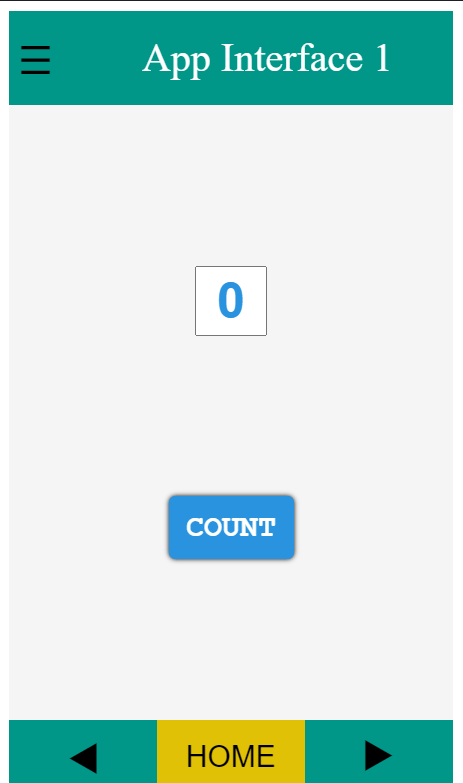
✔Creating Android App:

Now see the video to understand how to create Android app in a very simple way using HTML and CSS. 

Sunday 30 May 2021

Friday 19 March 2021

Thursday 15 October 2020

Monday 5 October 2020

Thursday 27 August 2020

Sunday 9 August 2020

SIMPLE DARK MODE SWITCH

SIMPLE DARK MODE SWITCH

output gif
Toggle Switch


In this blog we are going to make a simple but attractive Dark Mode toggle switch via HTML Checkbox. This required only fundamental or basic knowledge of HTML , CSS and JavaScript.

HTML:

CSS:

Java-Script:

Output:

See the Pen Dark Mode by ADITYA RAJ (@aditya9576) on CodePen.


Click here to subscribe this page to get
notified every-time a new post come.

Monday 15 June 2020

Making attractive CSS emotion showing BOT/ROBOT.

CSS ROBOT


image of output
CSS ROBOT


HTML:

<html>
<head>
  <title>ROBOT</title>
</head>
<link href="https://fonts.googleapis.com/css2?family=Titan+One&display=swap" rel="stylesheet">
<body>
  <div class="all">
    <div class="bod">
      <div class="hdd">
        <div class="face" onclick="angry()">
          <div class="eye1"></div>
          <div class="eye2"></div>
          <div class="nose"></div>
        </div>
        <div class="ear1"></div>
        <div class="ear2"></div>
      </div>
      <div class="neck">
        <div class="n1"></div>
        <div class="n2"></div>
        <div class="n3"></div>
      </div>
      <div class="hand1">
        <div class="ha1"></div>
        <div class="ha2"></div>
        <div class="ha3"></div>
      </div>
      <div class="hand2">
        <div class="hb1"></div>
        <div class="hb2"></div>
        <div class="hb3"></div>
      </div>
      <svg class="svg1" width="240px" height="280px" onclick="happy()">
        <polygon points="50 50,210 50,200 180,65 180" fill="#5C6BC0" stroke="#5C6BC0" stroke-width="50" stroke-linejoin="round"></polygon>
        <polygon points="70 50,190 50,180 80,80 80" fill="#f5f5f5" stroke="#f5f5f5" stroke-width="10" stroke-linejoin="round"></polygon>
        <ellipse cx="45" cy="70" rx="10" ry="20" style="fill:black;" />
        <ellipse cx="215" cy="70" rx="10" ry="20" style="fill:black;" />
        <ellipse cx="215" cy="70" rx="20" ry="10" style="fill:black;" />

      </svg>

      <div class="base"></div>
    </div>
    <svg class="svg2" width="240px" height="280px">
      <ellipse cx="115" cy="120" rx="80" ry="10" style="fill:gray;" />
    </svg>
    <div class="blog"><a href="https://coding-greed.blogspot.com/">CODING - GREED</a></div>
  </div>
</body>

</html>

CSS:(scroll)

body {
  background: -webkit-linear-gradient(20deg, #1760a5 0% 50%, #144f89 50% 100%);
}
.all {
  position: absolute;
  transform: translate(-50%, -50%);
  top: 60%;
  left: 50%;
}
.face {
  width: 200px;
  height: 100px;
  background: #5c6bc0;
  border: 1px solid #4262ab;
  border-radius: 50px;
  position: relative;
}
.hdd {
  z-index: 2;
  position: relative;
  animation-name: hov1;
  animation-duration: 2s;
  animation-iteration-count: infinite;
  animation-timing-function: linear;
}
@keyframes hov1 {
  0% {
    transform: translateY(0px);
  }
  25% {
    transform: translateY(4px);
  }
  50% {
    transform: translateY(-4px);
  }
  100% {
    transform: translateY(0px);
  }
}

.eye1 {

  width: 55px;
  height: 55px;
  background-color: green;
  border: 5px solid #f43e57;
  border-radius: 50px;
  float: left;
  position: relative;
  top: 18px;
  left: 25px;
}
.eye1:before {
  content: " ";
  position: absolute;
  width: 15px;
  height: 15px;
  border-radius: 15px;
  background-color: white;
  top: 20px;
  left: 20px;
}
.eye1:after {
  content: " ";
  position: absolute;
  width: 45px;
  height: 25px;
  background: -webkit-linear-gradient(
    -80deg,
    white 0px 15px,
    transparent 15px 45px
  );
  top: 0px;
  left: 8px;
  transform: rotate(20deg);
}

.eye2 {

  width: 55px;
  height: 55px;
  background-color: green;
  border: 5px solid #f43e57;
  border-radius: 50px;
  float: right;
  position: relative;
  top: 18px;
  left: -25px;
}
.eye2:before {
  content: " ";
  position: absolute;
  width: 15px;
  height: 15px;
  border-radius: 15px;
  background-color: white;
  top: 20px;
  left: 20px;
}
.eye2:after {
  content: " ";
  position: absolute;
  width: 45px;
  height: 25px;
  background: -webkit-linear-gradient(
    80deg,
    transparent 0px 15px,
    white 15px 45px
  );
  top: 0px;
  left: 6px;
  transform: rotate(-15deg);
}
.nose {
  width: 18px;
  height: 8px;
  background: #c5cae9;
  position: absolute;
  top: 80px;
  left: 90px;
}
.ear1 {
  width: 20px;
  height: 55px;
  background: #fbc02d;
  position: absolute;
  left: -28px;
  top: 25px;
  border-radius: 25px;
}

.ear1:before {

  content: " ";
  width: 8px;
  height: 26px;
  background: #fbc02d;
  position: absolute;
  top: 12px;
  left: -12px;
  border-radius: 10px;
}

.ear1:after {

  content: " ";
  width: 3px;
  height: 50px;
  background-color: whitesmoke;
  position: absolute;
  left: -9px;
  top: -43px;
}
.face:before {
  content: " ";
  width: 8px;
  height: 8px;
  background: #f43e57;
  position: absolute;
  border-radius: 8px;
  top: -30px;
  left: -39px;
  animation-name: blk1;
  animation-iteration-count: infinite;
  animation-timing-function: linear;
  animation-duration: 2s;
}
@keyframes blk1 {
  from {
    box-shadow: 0px 0px 15px white;
  }
  to {
    box-shadow: 0px 0px 0px white;
  }
}

.ear2 {

  width: 20px;
  height: 55px;
  background: #fbc02d;
  position: absolute;
  left: 210px;
  top: 25px;
  border-radius: 25px;
}

.ear2:before {

  content: " ";
  width: 9px;
  height: 26px;
  background: #fbc02d;
  position: absolute;
  top: 12px;
  left: 23px;
  border-radius: 10px;
}

.ear2:after {

  content: " ";
  width: 3px;
  height: 50px;
  background-color: whitesmoke;
  position: absolute;
  left: 25px;
  top: -43px;
}

.face:after {

  content: " ";
  width: 8px;
  height: 8px;
  background: #f43e57;
  position: absolute;
  border-radius: 8px;
  top: -30px;
  left: 233px;
  animation-name: blk1;
  animation-iteration-count: infinite;
  animation-timing-function: linear;
  animation-duration: 2s;
}
@keyframes blk1 {
  from {
    box-shadow: 0px 0px 15px white;
  }
  to {
    box-shadow: 0px 0px 0px white;
  }
}

.neck {

  width: 100px;
  height: 80px;
  z-index: 1;
  position: relative;
  top: -20px;
  left: 50px;
}
.n1,
.n2,
.n3 {
  width: 100px;
  height: 8px;
  background-color: black;
  position: relative;
  border-radius: 5px;
}
.n1:before,
.n2:before,
.n3:before {
  content: " ";
  width: 100px;
  height: 8px;
  background-color: black;
  position: absolute;
  border-radius: 5px;
  top: 24px;
}
.n1:after,
.n2:after,
.n3:after {
  content: " ";
  width: 100px;
  height: 8px;
  background-color: black;
  position: absolute;
  border-radius: 5px;
  top: 48px;
}
/*---------------------------------svg start here------------*/
.svg1 {
  position: absolute;
  left: -25px;
  top: 105px;
  z-index: 3;
}
.base
{
   width: 150px;
    height: 150px;
    background-color: whitesmoke;
    border-radius:150px;
    position: absolute;
    top:190px;
    left:30px;
    z-index: 2;
}
.hand1 {
  width: 40px;
  height: 70px;
  position: relative;
  /* left: 50px;*/
  top: -20px;
  transform: rotate(80deg);
  float: left;
  top: -40px;
  left: -40px;
}
.ha1,
.ha2,
.ha3 {
  width: 40px;
  height: 8px;
  background: black;
  border-radius: 10px;
  position: relative;
}
.ha2 {
  width: 39px;
}
.ha3 {
  width: 38px;
}
.ha1:before,
.ha2:before,
.ha3:before {
  content: " ";
  width: 37px;
  height: 8px;
  background-color: black;
  position: absolute;
  border-radius: 5px;
  top: 24px;
}
.ha2:before {
  width: 36px;
}
.ha3:before {
  width: 35px;
}
.ha1:after,
.ha2:after,
.ha3:after {
  content: " ";
  width: 34px;
  height: 8px;
  background-color: black;
  position: absolute;
  border-radius: 5px;
  top: 48px;
}
.ha2:after {
  width: 33px;
}
.ha3:after {
  width: 32px;
}
.hand1:after {
  content: " ";
  position: absolute;
  width: 8px;
  height: 8px;
  border-radius: 8px;
  background-color: white;
  left: 10px;
  top: 80px;
}
.hand1:before {
  content: " ";
  position: absolute;
  width: 35px;
  height: 35px;
  border-radius: 35px;
  border: 5px solid black;
  left: -6px;
  top: 80px;
}
/*hand 2*/
.hand2 {
  width: 70px;
  height: 70px;
  position: relative;
  float: right;
  transform: rotate(-80deg);
  top: -10px;
  left: 23px;
}
.hb1,
.hb2,
.hb3 {
  width: 40px;
  height: 8px;
  background: black;
  border-radius: 10px;
  position: relative;
  left: 50px;
  transform: flip(1);
}
.hb2 {
  width: 39px;
}
.hb3 {
  width: 38px;
}
.hb1:before,
.hb2:before,
.hb3:before {
  content: " ";
  width: 37px;
  height: 8px;
  background-color: black;
  position: absolute;
  border-radius: 5px;
  top: 24px;
}
.hb2:before {
  width: 36px;
}
.hb3:before {
  width: 35px;
}
.hb1:after,
.hb2:after,
.hb3:after {
  content: " ";
  width: 34px;
  height: 8px;
  background-color: black;
  position: absolute;
  border-radius: 5px;
  top: 48px;
}
.hb2:after {
  width: 33px;
}
.hb3:after {
  width: 32px;
}

.hand2:after {

  content: " ";
  position: absolute;
  width: 8px;
  height: 8px;
  border-radius: 8px;
  background-color: white;
  left: 60px;
  top: 80px;
}
.hand2:before {
  content: " ";
  position: absolute;
  width: 35px;
  height: 35px;
  border-radius: 35px;
  border: 5px solid;
  border-image: black;
  left: 40px;
  top: 80px;
}
/*--------hover effect--------------*/
.bod {
  animation-name: hover;
  animation-timing-function: linear;
  animation-iteration-count: infinite;
  animation-duration: 2s;
}
@keyframes hover {
  0% {
    transform: translateY(0px);
  }
  25% {
    transform: translateY(-8px);
  }
  75% {
    transform: translateY(8px);
  }
  100% {
    transform: translateY(0px);
  }
}
.blog
{
    width:220px;
    height:40px;
    position:absolute;
    top:420px;
    border-radius:5px;
    background:#F4F0EF;
    text-align:center;
    box-shadow:0px 0px 5px gray;
}
a
{
    text-decoration:none;
    font-weight:bolder;
    font-size:1.6em;
    position:relative;
    top:10%;
    font-family: 'Titan One', cursive;
    color:#4A235A;
}

JavaScript:


//click on the face to make the robot angry 😡 and then on the chest to make it happy😁.
function angry() {
  var fa = document.getElementsByClassName("eye1")[0];
  var fb = document.getElementsByClassName("eye2")[0];
  fa.style.backgroundColor = "red";
  fb.style.backgroundColor = "red";
}

function happy() {

  var fc = document.getElementsByClassName("eye1")[0];
  var fd = document.getElementsByClassName("eye2")[0];
  fc.style.backgroundColor = "green";
  fd.style.backgroundColor = "green";
}


OUTPUT: 

See the Pen Emotional ROBOT by ADITYA RAJ (@aditya9576) on CodePen.


Click here to subscribe this page to get
notified every-time a new post come.