Sunday, 13 October 2019

Attractive loading animation

Attractive Loading Animation
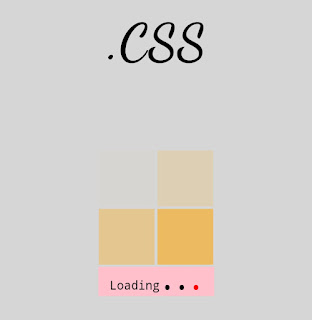
image of output
Image of Output
HERE IS THE SIMPLE ATTRACTIVE LOADING ANIMATION , MADE WITH HTML AND CSS ONLY.

HTML:
<!DOCTYPE html>
<html>
<head>
<title>Page Title</title>
</head>
<body>
<p>
<center><tt><b>Attractive Loading Animation !!</b></tt></center>
</p><br>
<div>
<center> <tt><b class="top"><a href="#"><span>.CSS</span></a></b></tt>
</center>
</div>
<table border="0">
<tr>
<td>
<div class="b2"></div>
</td>
<td>
<div class="b3"></div>
</td>
</tr>
<tr>
<td>
<div class="b1"></div>
</td>
<td>
<div class="b4"></div>
</td>
<tr style="background-color:pink;">
<td style="font-size:15px;" colspan="2">
<center><tt>Loading<span>.</span><span>.</span><span>.</span></tt></center>
</td>
</tr>
</tr>
</table>
</div>
</body>
</html>


CSS:
body {
background-color: #cccc;
}
.top {
font-family: cursive;
font-size: 2em;
}
table {
position: absolute;
transform: translate(-50%, -50%);
top: 50%;
left: 50%;
padding: 0px;
border: 0px;
}
.b1,
.b2,
.b3,
.b4 {
width: 70px;
height: 70px;
background-color: orange;
}
.b1 {
animation-name: a1;
animation-iteration-count: infinite;
animation-duration: 2s;
opacity: 0;
}
.b2 {
animation-name: a2;
animation-iteration-count: infinite;
animation-duration: 2s;
animation-delay: 0.4s;
opacity: 0;
}
.b3 {
animation-name: a3;
animation-iteration-count: infinite;
animation-duration: 2s;
animation-delay: 0.8s;
opacity: 0;
}
.b4 {
animation-name: a4;
animation-iteration-count: infinite;
animation-duration: 2s;
animation-delay: 1.2s;
opacity: 0;
}
@keyframes a1 {
0% {
opacity: 0;
}
25% {
opacity: 1;
}
100% {
opacity: 0;
}
}
@keyframes a2 {
0% {
opacity: 0;
}
25% {
opacity: 1;
}
100% {
opacity: 0;
}
}
@keyframes a3 {
0% {
opacity: 0;
}
25% {
opacity: 1;
}
100% {
opacity: 0;
}
}
@keyframes a4 {
0% {
opacity: 0;
}
25% {
opacity: 1;
}
100% {
opacity: 0;
}
}
span {
font-weight: bolder;
font-size: 2em;
}
span:nth-child(1) {
animation-name: clr1;
animation-duration: 3s;
animation-iteration-count: infinite;
}
span:nth-child(2) {
animation-name: clr2;
animation-duration: 3s;
animation-delay: 1s;
animation-iteration-count: infinite;
}
span:nth-child(3) {
animation-name: clr3;
animation-duration: 3s;
animation-iteration-count: infinite;
animation-delay: 2s;
}
@keyframes clr1 {
0% {
color: red;
}
33% {
color: red;
}
34% {
color: black;
}
100% {
color: black;
}
}
@keyframes clr2 {
0% {
color: red;
}
33% {
color: red;
}
34% {
color: black;
}
100% {
color: black;
}
}
@keyframes clr3 {
0% {
color: red;
}
33% {
color: red;
}
34% {
color: black;
}
100% {
color: black;
}
}
a {
text-decoration: none;
}


OUTPUT:
Share:

Related Posts:

No comments:

Post a Comment